Color is the most impactful element in makeup. It can add dimension, add drama, set a mood, and shape and define facial features. Knowledge of color and how to use it is key for the professional makeup artist to mix, match, and blend colors to create beautiful, balanced looks.
Understanding how to use color will help makeup artists enhance skin tone, eye color, and hair color, and will also allow them to make sure designs are uniform and attractive. Unattractive and discordant color can be used in the wrong way, which is why theory is important.
Color Theory
The Color Wheel
First, we need to learn about the color wheel. The color wheel has primary colors, secondary colors, and tertiary colors:
Red, blue, yellow — the colors that all other colors start from.
Secondary Colors: Green, orange, purple — made from mixing primary colors.
Tertiary Colors: Mix and match primary and secondary colors to create softer colors.
Warm vs Cool Tones
If you look best in warm colors like red, orange, and yellow, it’s because they tend to radiate warmth and energy. They also create a lovely contrast against warmer skin tones.
Cool Colors: Blue, green, purple — make you look relaxed, elegant and match cool complexions.
Neutral Colors.
Beige, taupe, brown, gray: Neutral tones that complement brights or add natural softness.
Complementary Colors
Colors Directly Across from Each Other on the Color Wheel
Opposites attract! Complementary colors contrast each other and help them stand out. Example:
Blue shadow with orange-brown eyeliner makes your eyes pop.
Purple and yellow eye shadow shades can accentuate particular attributes.
How to Incorporate Complementary Colors
Use one as the primary color and the other as an accent.
Don’t cake the entire face with an equal amount of both colors to balance them out.
Try blending to smooth out shifts from one color to another that are in close proximity to each other.
Analogous Color Combinations
Harmonious Shade Groupings
Analogous colors are those colors that are adjacent to one another on the color wheel and produce soft, harmonious palettes. Example:
A blend of pink, coral, and peach eyeshadow for a romantic, girlie look.
Greens and blues to give it a cooler, fresher look.
General Advice
Begin with the lightest color on the inside corner of your eye, getting progressively darker as you work your way outward.
This will help you remove any sharp transitions between colors, ensuring your gradient looks smooth and professional.
Triadic Color Combinations
Balanced, Vibrant Looks
Triadic color schemes involve three colors that are equally spaced around the color wheel. This delivers energetic and creative effects, but won’t cause discord.
Example: Red, yellow, and blue for artistic, statement looks.
Limit your palette to a dominant color and a couple secondary colors to prevent visual overload.
Playing Up Your Best Assets With Color The Eyes
Choose shades of eyeshadow based on your eye color for a more striking appearance.
Brown eyes are complemented by copper and bronze warm shades.
Purples and blues are cool shades that will make green eyes pop.
Skin Color
Those with fair skin look best in soft pastels and muted colors.
Those with medium skin tones can pull off muted and bold hues.
The best bet for deeper skin tones: “Jewel tones like fuchsia or navy blue,” says Harris.
Cheeks and lips:
Match lip and blush colors to the eye color for harmony.
Opt for similar tones for a more natural effect, or opposing hues for a more dramatic look.
All about texture and finish… Matte, Satin, Shimmer
Matte Shades: Great for all over the lid or creating definition; creates a sharp edge and gives dimension.
Satin Shades: Provides natural looking radiance and easy blendability.
Shimmer/Metallic: Use to accentuate or create a bold dramatic look for night-time or makeup photo shoots.
What happens when you mix finishes?
Mix matte and shiny to add depth (like a matte crease and a shiny lid).
Too much shine over big expanses can overwhelm the eye.
Color Correction Techniques
Neutralizing Discoloration
Color-correcting: If you have redness, use a green concealer. If you have sallowness, use a purple concealer. If you have dark circles, you can use a yellow or orange concealer.
Colour correct with an orange or peach concealer under the eyes if you have medium to deep skin.
Lavender or purple for yellow or sallow skin tones
Celebrating Natural Beauty
Lighten up the under-eye with a concealer a shade or two lighter than your skin tone.
Highlight and contour. Control light and dark.
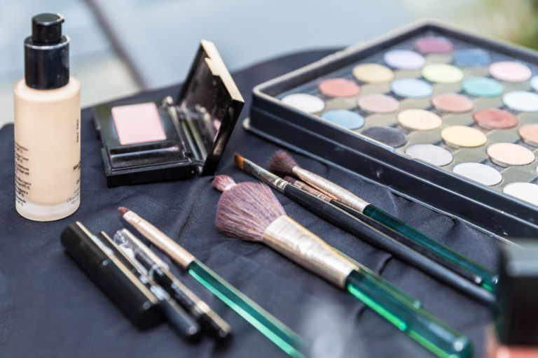
Which tools to use depends on how you want the color to be applied. Here are some options:
Quality Brushes: Various shapes to blend, detail and build colors.
Sponges: Ideal for applying cream or liquid products.
Mixing Palettes: Enables testing personal color matchups prior to painting.
How to Use Color Like a Pro
Always test out colors on swatches before you use them on your face.
Think about the lighting. Was it in natural light, a studio, or a big event with artificial lighting? Colors are perceived differently in each environment.
Begin with a light application and deepen as needed for accuracy.
Maintain a color journal or portfolio for color combinations that work well to show to clients.